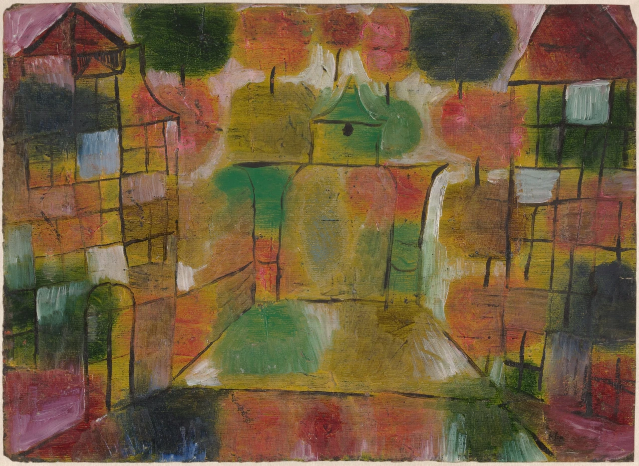
The town in Paul Klee’s Tree and Architecture: Rhythms is having trouble with its cast. Two red roofs take the upper corners, each propped on black uprights. Between them, a pointed green form might be a third roof until rounded green paint swells below it and makes the figure botanical. A black dot sits where a window, a knot, or an eye could go. The scene keeps changing which parts are scenery and which are alive.
Read as a stage, the peculiar construction begins to make sense. The corner buildings serve as wings. Their gridded walls crowd the sides while the middle stays relatively open. A broad, pale-edged shape projects from the lower center like a platform. Above it, the pointed green figure occupies the place where a performer would stand. Nothing here proves that Klee meant to paint a theater. The arrangement simply gives the eye a lively way to follow what the forms do: they enter, take a role, and lose it to the next patch of color.
The left tower begins with a persuasive roof. A wine-red triangle sits under a pale pink slope, and two black posts descend from it. Then the building starts to improvise. A loose black loop hangs below the roof like a balcony drawn in midair. One post stops early. A heavy blue-black block fills the upper wall while blue, white, rose, olive, and red rectangles accumulate below. The black lines divide them, but the colors rarely behave like rooms. They spread across several compartments or leave a compartment only partly occupied.
The right tower performs the same routine with different timing. Its roof is broader and redder. Beneath it, the grid holds a pale blue rectangle, a white one, several greens, and a dark square near the lower edge. Some panes are clear enough to resemble windows. Others merge with paint outside their frames. This imperfect pairing matters. The two towers establish a scene with the confidence of matching brackets, then disagree on nearly every interval inside them.
At 27.9 by 38.3 centimeters, the entire performance fits on a sheet of paper scarcely wider than a laptop screen. Klee painted it in oil in 1920. The National Gallery of Art holds the sheet today. The modest size sharpens its comedy of scale. A few centimeters of black line can stand for a wall, while a thick sweep of green can become a tree crown, a shadow, and a piece of weather before the eye reaches its edge. Wide strokes remain visible across the paper. Pale pink and white brush over darker passages near the top; ocher, green, and rose meet in rounded fields whose borders fade or double back. Black lines sometimes sit firmly above the color and sometimes seem to sink into it. The surface retains several decisions at once. Architecture arrives as a set of names for marks that continue to look and act like paint.
This is where the tree enters most persuasively. Dark green masses gather across the upper band, and short black verticals hang beneath several of them. The combination gives canopy and trunk in the smallest possible shorthand. Yet no single crown owns a complete trunk, and no trunk reaches dependable ground. The trees have been distributed through the architecture like a chorus. One appears at the left, another near the center, another at the right, each repeating the same basic cue with a change of width, color, or placement.
Klee had already found a useful relation between building and repeated color during his 1914 journey to Tunisia. In his diary, he called the landscape a “patchwork rhythm.” His Country Houses on the Beach from that year keeps cube-like buildings legible while arranging them in geometric color that does not report local appearances faithfully. The earlier watercolor supplies context rather than a key. By 1920, in Tree and Architecture: Rhythms, the patches have acquired a stranger freedom. They can support a building, pass through it, or turn it into vegetation.
The plural “Rhythms” is exact. One rhythm belongs to the black network: upright, crossbar, pause, another upright. Another belongs to the colored masses: green thickens, red answers, yellow opens, green returns. The roofs make a slower recurrence from corner to corner. Pale marks flicker more quickly through the middle. These sequences overlap without sharing a fixed beat. Klee, a lifelong violinist, later used musical rhythm and irregular line in his teaching about the organization of a surface. Here the useful musical fact is simpler. A repeated part can remain recognizable while changing its force each time it returns.
That principle governs the central figure. Its little green gable repeats the corner roofs, though its black horizontal bar also suggests outstretched arms. A small dark spot under the point gives it a face for a moment. The green mass to the right can attach itself as a shoulder, then detach as a tree crown when the short black vertical beneath it comes into focus. Below, two immense rounded blocks of green, ocher, pink, and yellow rise like a body behind a table. The cast has no stable boundary because every contour can be recruited by a neighboring role.
The same uncertainty changes the apparent space. The pale vertical channels beside the central mass resemble paths receding between buildings. The broad lower platform interrupts that depth and pushes forward. A thin black diagonal at left behaves like the edge of a road until it reaches a block of color and becomes a seam. Instead of one continuous town, the sheet offers local pieces of town, each convincing within a few lines and unusable as soon as the eye tries to travel through it.
There are no painted inhabitants to correct the scale. A blue pane can be a window until it looks larger than the supposed door below. The central black dot can serve as a face until the green gable becomes a roof again. This absence gives the forms permission to change size along with identity. A tree can tower over a building at the upper left, shrink into an ornament at the center, and return as a dark block at the right.
The performance ends only at the paper’s edge. A rose block enters at the lower left, dark blue settles beside it, and a long red-brown band runs beneath the central platform before green and black gather at the right. These are firm painted presences, not a floor that restores ordinary perspective. The last row keeps the cast in view after architecture has lost its authority to place them. Klee’s town remains standing because every part is free to play more than one part.