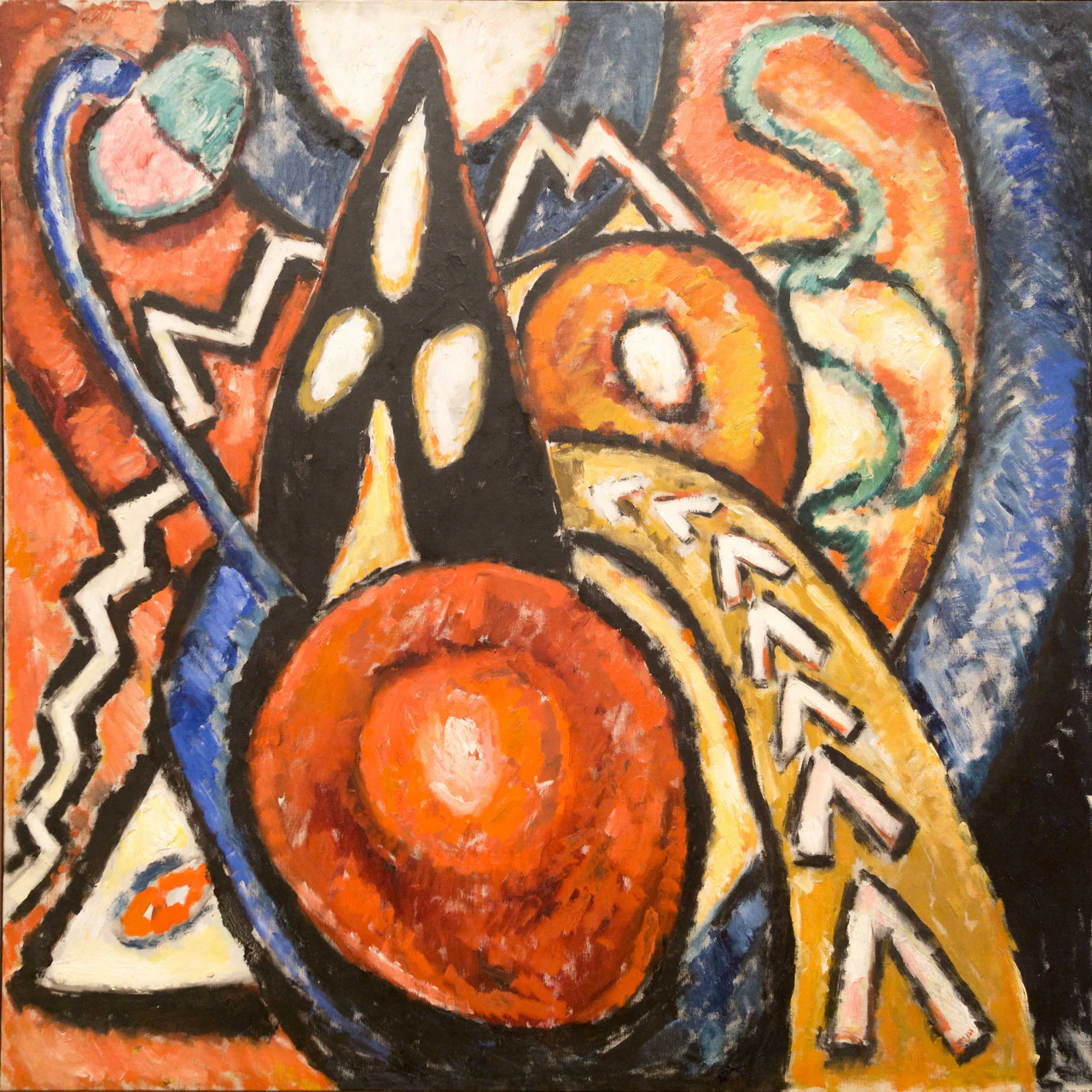
An owl has taken the middle of Marsden Hartley’s Movement. Its head is black and pointed. Two white ovals serve as eyes, an orange wedge makes a beak, and a pale vertical stroke rises like a crest. The enormous red disc below supplies a breast. This is an unofficial owl, assembled by the habit of turning marks into living things, but it is hard to evict once it appears.
The anatomy soon becomes inconvenient. The eyes sit too far apart and at different angles. The supposed crest could be a third eye, a candle, or a hole admitting light through the black. The red body has its own small pale center, which makes it look equally like a target, a gong, a flower seen from above, or a second face. Nothing in the picture confirms a bird. Almost everything encourages the attempt.
Movement keeps producing nouns in this manner. At the upper left, a green and pink form enclosed by blue can be a heart, a leaf, or a piece of fruit. White zigzags descend beside it as lightning, steps, or the edging on a uniform. Across the upper right, a green band bends into an S, while two pale compartments swell beneath it. Serpent, plume, ribbon, intestine: each name works briefly, then an adjoining color changes the grammar.
The ocher arc on the right is the busiest offender. White angular marks march along it. They resemble arrowheads, chevrons, teeth, birds in profile, or a broken alphabet. Their repetition makes them look intentional in the manner of notation, but repetition does not make them readable. One mark points inward, another seems to climb, and the next collapses into a pale patch. The row promises a message through rhythm while withholding a stable sign.
That near-legibility is the painting’s liveliest motion. The forms do not need to travel across the canvas. A black peak changes from mountain to hood to animal head while staying in place. A white oval can move from eye to aperture without shifting by a millimeter. Recognition performs the movement, crossing categories faster than the paint can settle into any one of them.
Hartley gave this activity a body large enough to meet the viewer. The oil painting measures 119.5 by 119 centimeters, almost four feet square. On a small screen, its black contours can pass for the clean divisions of a badge or diagram. At full scale, the system roughens. Black thins to gray-blue where the brush drags. Orange enters the red disc in blunt strokes. White shapes carry pink, yellow, and bare-looking interruptions. The possible symbols have edges, but those edges record a hand repeatedly finding and losing them.
The broad black divisions assist recognition because they separate colors as decisively as the lines in a pictogram. They also sabotage it. A contour beside the red disc widens into a dark basin. The central peak merges with the black field above it, then breaks against cream and blue. On the left, black surrounds a white zigzag until border and object compete for attention. What seems drawn around a thing can become the thing itself.
The painting’s names have been nearly as restless as its forms. The Art Institute of Chicago now calls it Movement. The Marsden Hartley Legacy Project uses the plural Movements and records three alternates: Movement, Motion, and Symbolic Abstraction. Singular movement suggests one governing action. The plural permits several. Motion sounds physical. Symbolic abstraction makes the marks seem available for decoding. No title fully controls the encounter, but together they describe its competing impulses.
Hartley painted the work in Berlin in 1913. German Expressionism offered a setting in which color and shape could carry force without serving a recognizable scene. The Art Institute connects Hartley’s ambition to that of Wassily Kandinsky and to music, valued as a nonnarrative art that could organize an experience without illustrating a story. The analogy suits this painting because music gives recurrence and interval exact work to do without turning them into objects.
Hartley’s marks behave with a comparable independence. White zigzags recur at the left, near the top, and along the ocher band, but they do not denote one thing. Blue appears as a hook, a diagonal strip, a blunt field, and a narrow border. Orange can be ground, wedge, halo, or the hot interior of the red disc. Repetition establishes kinship while allowing each appearance a different task.
The comparison with music can make the painting sound more orderly than it looks. Its intervals are clogged, its colors rub into one another, and its repeated marks keep changing thickness. There is no staff, key, or agreed direction of performance. The work offers something closer to a score discovered without its legend, complete with emphases and returns but open to wrong instruments, invented creatures, and private tempos.
This openness does not turn the canvas into a free-association test where any answer is as persuasive as another. The painting sets terms. The two white ovals earn their temporary life as eyes because they sit symmetrically enough inside black. The orange wedge earns its beak because it occupies the space below them. A reader can make an owl from those relations. Calling the blue strip a violin would require the work to supply much more than it does.
Abstraction here sharpens the difference between seeing and naming. The red disc is unquestionably round, low, warm, and dominant even when its identity changes. The ocher band rises from the lower right and curves toward the center regardless of whether its white marks are arrows or teeth. Hartley leaves color, position, direction, and scale available as firm evidence. The nouns remain provisional.
That distinction lets Hartley make abstraction exact without closing it. The canvas can admit an owl, a target, or a score, yet each reading remains accountable to the placement and pressure of the paint. Movement needs no hidden legend and no single key. Its order resides in the relations Hartley made visible, durable enough to hold while every possible symbol remains open.