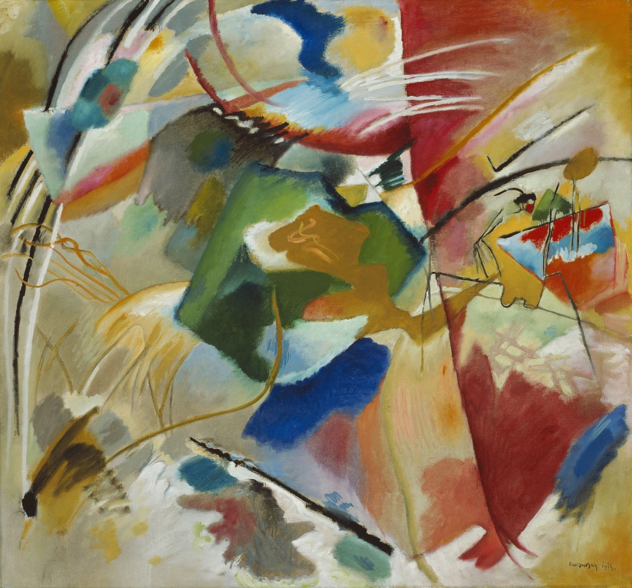
In 1913, Vasily Kandinsky gave an abstract painting a title that sounds like a set of directions: Painting with Green Center. Find the green and the picture will tell you where you are. The instruction works for about a second. A large green mass occupies the middle, while nearly every line crossing the canvas proposes a different route through it.
The title has selected one feature from a very crowded field. Green gains the authority of a place name. Red remains a broad territory at the right. Blue appears in patches above and below. Yellow pools in the corners and pushes through the center. Black receives no location in the title, although black lines travel farther than any color. Naming the center makes the painting easier to enter and more difficult to settle.
This oil on canvas measures 108.9 by 118.4 centimeters, wide enough for its longest marks to register as gestures rather than decoration. The green area lies a little left of the geometric midpoint. Its boundary swells and contracts. Olive, emerald, blue-green, gray, and near-black collect within it, so even the designated color has several climates. Across its upper half sits an ocher shape with a pale border and a loose, curling line inside. Below, darker green extends like a bent limb. The center has thickness, joints, and weight.
Other colors behave more like weather. Pale blue and white spread across the upper middle with their edges brushed into neighboring pink and gray. A red column on the right begins as a dense block near the top, thins through rose, and gathers force again as a deep triangular descent. Along the bottom, blue, peach, cream, red, gray, and white occupy one another’s margins. These fields take time to cross. Their changes happen by degrees.
The lines use another clock. Two black arcs enter from the upper left and leave the frame before they can enclose anything. A red curve drops from the top, loops behind a blue patch, and disappears into a crowded seam. Three white strokes race across the red in the upper right, parallel for a moment, then separate. A black diagonal rises from the lower middle with the abruptness of a barrier laid across softer paint. None of these lines needs the permission of the color beneath it.
Perceived speed is only partly a matter of length. A broad color field reveals each decision slowly because the eye attends to its interior, its density, and its changing edge. A line compresses a decision into direction. Even when its actual making may have taken time, it presents itself as a single departure. Kandinsky loads the canvas with both experiences. Color accumulates; line bolts.
The upper left makes their independence especially clear. Gray, yellow, pink, blue, and turquoise form a loose stack of sloping bands. The black arcs pass across the stack at their own angle. They resemble the contour of a great loop that continues beyond the frame, yet the colored bands decline to become its interior. Drawing and painting share the same patch of canvas while keeping separate accounts of the space.
At the right edge, the arrangement grows more compact and comic. Thin black marks bend around a mustard patch. A small red knob sits at one bend; another line doubles back on itself; several narrow uprights descend through blue, red, and pale green. The cluster can briefly suggest a machine, a creature, a rider, or handwriting. Each possibility recruits a few marks and leaves the rest unemployed. Recognition starts several times and never hires a full cast.
Kandinsky had spent the preceding years giving color and form greater freedom from recognizable subject matter. He helped establish the Blue Rider group in 1911, and his writing argued that abstract elements could act directly on feeling. Museum accounts of his work from this period emphasize a dynamic language in which color and line separate within space that has no fixed perspective. Painting with Green Center makes that separation easy to experience. Its marks coexist without pretending that they all describe the same thing in the same way.
The painting still keeps fragments of ordinary seeing in circulation. A heavy dark arch can recall architecture. The ocher form over green can acquire the posture of a reclining body. The small tangle at right can behave like an incident viewed from far away. These associations matter as temporary uses for the marks. They give a line or patch a role, then another relation draws it elsewhere. The picture turns recognition into a local event.
A map offers a useful comparison, provided nobody expects reliable directions. The color fields resemble regions; long curves suggest routes; sharp black marks look like borders; the title supplies a named center. Yet the systems use incompatible scales. The large black arc at upper left belongs to something far bigger than the nearby turquoise patch. The tiny linear commotion at right carries more incidents per inch than the expansive green. A person following the lines would cross the colors without learning what country they had entered.
The green earns its central designation through duration. It takes up enough area to slow the eye, and it contains more internal changes than the flatter red or blue fields. Ocher crosses it. Gray presses into its upper edge. Dark green gathers below. A narrow gold line drops through its lower half and continues into pale blue. The center functions as a busy junction whose traffic remains visible. Every crossing leaves the underlying place partly intact.
That quality gives the center an unexpected kind of generosity. It can host a body-like ocher mass, a dark contour, a blue pocket, several green tones, and a trailing line without fixing their identities. Elsewhere, marks sometimes collide harshly. A white slash cuts through red; black punctures cream; orange shoulders into blue. Within the green, differences have room to linger beside one another.
Kandinsky’s theories can tempt a reader to assign each color a stable emotional meaning, as if the painting arrived with a hidden legend. The canvas offers a livelier task. Watch what a color does here. The red carries weight at the right and speed where it narrows into a curved stroke. Yellow becomes a field, a line, and a flash along an edge. Blue can float, sink, or interrupt. Green becomes a center because the title says so, then has to perform that role under pressure from every neighboring mark.
The eye adapts by changing pace. It lingers inside a stained field, accelerates along an arc, pauses at a hard junction, and loses a thin line in pale paint. No single tempo can survey the whole. The canvas distributes attention through these repeated changes of gear, until looking starts to resemble the painted surface: broad passages crossed by quick ones, each retaining its force.
Near the top, the three white strokes provide the painting’s clearest demonstration. They cross red and pale pink before thinning into a cream-colored field. The colors beneath them alter while their direction holds. For those few inches, line keeps its speed across three different conditions. The painting has many centers because every mark carries its own measure of distance, and every crossing starts the space again.