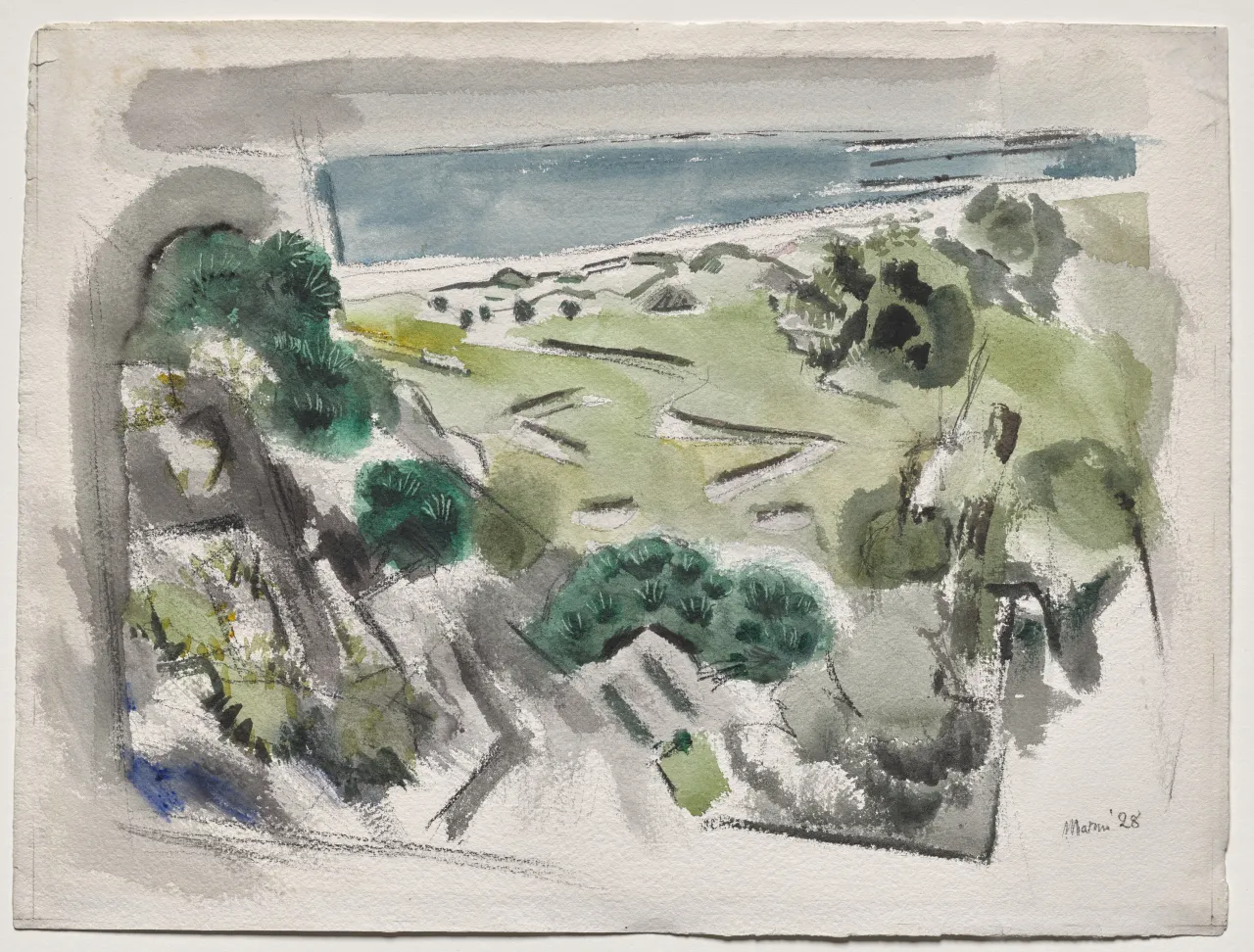
Black reaches the edge first. In John Marin’s On Morse Mountain, No. 6, Maine, a thick bar of charcoal and inky wash rides the top of the sheet from left to right, dense enough to feel like a ceiling. The band is uneven. Its lower edge is jagged, bitten by the white of the paper where the brush has lifted or the end of the brush has scraped through. Below it, two heavy vertical passages close the sides. The left wall stands almost solid, the right wall breaks and reforms as it descends. A lower dark field anchors the bottom, more mottled than the top but still insistent. Together they enclose a pale, almost nervous opening at the middle. The painting measures 42.3 by 56.5 centimeters, a horizontal sheet meant to be held at arm’s length, and the first experience at that distance is of air held inside walls, with a mountain forming inside that enclosure.
The Cleveland Museum of Art, which acquired the sheet in 2020 as part of the Nancy F. and Joseph P. Keithley Collection Gift, describes the technique plainly: watercolor and black crayon and reductive work with the end of the paint brush on thick, moderately rough-textured wove paper. Marin laid dry charcoal to create areas of shocking black and then layered inky black wash over it, and that layered darkness has the effect of framing the image and pulling the eye toward the center. He painted this in summer 1928, one of his last sustained Maine summers, during his Movements in Paint period.
Enter that center and the place becomes legible without becoming illustrative. Thin, angular lines in black crayon sketch a fractured ridge that rises and falls across the middle. The line breaks, doubles back, and leaves gaps where white paper remains untouched. Between those lines, washes so thin they register as tint and suggest distance and volume. A pale blue pools in two small basins that read as coves between promontories. A warmer wash of ochre and faint pink brushes the lower slope, enough to separate land from water without modeling it. White paper does the rest, supplying the light the ridge encloses, the sky the mountain interrupts, and the water the land compresses. The paper’s rough texture catches the wash at its peaks and leaves its valleys bright, so even the quietest tint carries a granular edge.
Morse Mountain sits on the Small Point peninsula in Phippsburg, Maine, a low, forested ridge that drops to a narrow cove and a barrier beach. Marin painted there in the summer of 1928, and Cleveland’s group of related sheets from the same summer, numbered 2020.134 through 2020.139, shows him returning to the same stretch of coast with different pressures and palettes. In No. 6 the ridge recedes through the relative weight of marks and the intervals of white between them. Black lines pressed harder sit on top of dried washes nearby, while lighter lines leave broader white fields farther away. That watercolor logic is what Marin refined over fourteen Maine summers, from 1914, when the rocky coast first became his central subject, through this final sustained season in 1928.
The handling deserves a slower account because it explains how a sheet that looks at first like a framed view behaves instead as a single constructed surface. Marin began with charcoal, a dry, particulate black that grips rough wove paper and makes a matte, slightly dusty field. Over that he pulled a fluid wash of black that sank into the paper’s fibers and cooled the charcoal’s warmth. Where he wanted a line of light inside the darkness, he turned the brush around and dragged its wooden end through the wet wash and the soft charcoal beneath, revealing a sharp white incision that carries a fine ridge of displaced pigment on either side. Those scraped lines are most visible in the upper black bar, where several fine, lightning-like whites cut diagonally and horizontally across the dark, and along the side walls, where shorter ticks keep the enclosure from sealing. In the pale center, the same tool in reverse leaves faint embossed grooves that catch no pigment at all, acting as reserves that keep a later wash from settling. The sheet therefore records two kinds of drawing: additive charcoal and wash, and reductive scraping that removes or displaces what has just been laid.
Color in the center respects that economy. Blue arrives as a watery veil, diluted until its edge feathers into white. Where the blue meets a crayon line, the pigment darkens fractionally as it pools against the slight ridge, making the line appear to hold the color. Ochre is even more sparing. It touches the paper in short, dry-brushed passages that skip across the tooth and leave flecks of white inside the warm field. The warmth never mixes with the blue to make green. The two hues remain separate intervals, and the white between them does the work of atmosphere. At the lower right, Marin’s inscription, Marin ’28, is written in a thin, unaccented hand with the same black used for the ridge. It sits just inside the lower dark field, small enough that it does not anchor the composition. On the reverse, in pencil, he wrote On Morse Mountain / #6-28 and, underneath, No 5 with that number scribbled out, a small revision that shows the series in progress.
That series places No. 6 in time. Marin was fifty seven in 1928, an American modernist whose reputation had been built in large part by Alfred Stieglitz’s galleries, first at 291 and later at An American Place. Stieglitz exhibited him steadily, photographed him, and presented his watercolors as evidence that an American handling of place could carry international modernist force. In January 1930, the sheet would be among the recent watercolors of New Mexico and New York shown at An American Place. Six years later, the Museum of Modern Art gave Marin a retrospective that confirmed his standing. Ruth Fine’s essay for the Keithley Collection catalogue, published by the Cleveland Museum of Art in 2022, places No. 6 in that longer arc and notes how different its character is from the earlier Maine watercolors of 1914 represented nearby in the same collection, works where thin linear scaffolds and ample white keep the coast open and breathing.
Earlier and later Marin Maine watercolors help clarify what 1928 compresses. The 1914 Small Point sheets tend to keep the paper dominant. A few penciled diagonals and a spare wash of blue locate a point and a cove, while vast white holds the sky and sea as active fields. Black, when it appears, arrives as a linear accent, a strong diagonal that cuts across the white like a spar. In No. 6, the proportion reverses. It occupies perhaps forty percent of the sheet if measured simply by coverage, and it occupies more than that if measured by visual weight. The white at the center remains as light that has been kept. That shift matters because watercolor is traditionally understood through transparency, the white of the paper shining through diluted pigment to make air. Marin honors that tradition inside the center, where transparency still carries distance, while opacity becomes construction at the perimeter.
The phrase Movements in Paint, which Marin used for most of the watercolors he made in this late Maine period, points to that refusal as an intention, a deliberate shape of work. A movement implies a bounded duration, a span with a beginning and an end, a shape made by motion, carried by the hand's timing. For Marin, who often wrote that the hand should move the way water moves, the phrase suggests that a watercolor records a sequence of decisions in time, not a view arrested in space. The scraped lines through black, the layering of charcoal under wash, the thin veils of blue left to dry before a crayon ridge is reinforced, each marks a different moment and remains visible as such. The painting keeps each moment visible, showing its intervals across the surface.
Those intervals are also what keep the work from settling into a conventional landscape with a decorative border. The black frame is irregular in ways that prevent it from becoming an architectural motif. Its top edge is higher on the right than on the left, its thickness varies, and its scraped whites do not align into a pattern. The side walls do not meet the top at clean corners. They overlap or leave small notches of white where pressure was lifted. The lower dark field is the most porous, admitting small incursions of pale wash that keep it from reading as ground. If a later hand had added a painted border to a finished watercolor, the border would sit outside the image and declare itself as a frame. Here the border is the image. It participates in the same drawing system as the mountain, made with the same charcoal, the same wash, the same scraping. That continuity of means makes the enclosure feel discovered, as if the mountain’s form required a pressure around it to become visible.
Seeing the enclosure as pressure changes how the center is understood. The pale opening is a charged field that the surrounding darks compress and, by compressing, animate. The thin ridge lines inside gain a sense of bulk because the surrounding darks already press against them. A short, slightly heavier black zigzag near the middle can stand for a cliff face because a small dark next to a larger white reads as a plane turning away from light. A faint horizontal scrape just below that zigzag keeps the cliff from becoming a symbol. It reminds the eye that the surface is paper handled with tools, and that handling is the evidence for space.
This is where Marin’s abstraction remains tethered to a specific coast without depending on description. The painting keeps the particular condition of that place, a low mountain close to water, a cove with two small blue intervals separated by a promontory, a sky held between forested slopes, yet it renders that condition through interval, weight, and reserve to carry the place. The difference allows the work to be read accurately by someone who knows the peninsula and also by someone who knows only the behavior of wash on rough paper. Both viewers can follow the argument because the argument is made of visible relations, not of coded references.
Marin’s larger reputation can make that specificity harder to hear. He is often presented as a precursor, a figure whose watercolor handling, stretches of bare canvas, and linear freedom caught the eye of younger painters who became Abstract Expressionists, or as a modernist who proved that American place could be rendered in a language learned partly in Europe between 1905 and 1911. Martha Tedeschi, Kristi Dahm, and Ruth Fine’s study John Marin’s Watercolors: A Medium for Modernism, published by the Art Institute of Chicago in 2011, gives that larger place a careful history, tracing his early European study, his mastery of a watercolor that moves from transparency to strong opacity, and his Maine summers as a sustained exposure to the moods of sea and sky. That history is relevant, while No. 6 stands on its immediate, local stakes. It asks whether a watercolor can make darkness structural and still retain the light that gives watercolor its particular capacity to feel like air.
The answer is carried by proportion. The central white is small enough that it needs defense, large enough that it repays attention. Its boundary follows the demands of ridge and wash, so the interval feels found. Within it, the emptiest passage sits near the upper middle, a reserve of paper that touches the top dark on one side and a thin crayon ridge on the other. That reserve holds. Below it, the blue coves give the white a measured counterpart, a color that names water without describing it. Below them, the ochre slope gives the white a warm base. The progression from empty white to blue to warm white makes a vertical reading that suggests foreground and distance without establishing a foreground plane. The eye moves down the center the way a foot might move down a slope, from thinner air to more sheltered ground, the movement is cued by hue and density.
Look again at the scraped whites in the black. They are removals, thin lines where pigment has been displaced to reveal the paper that was there before. In that sense they belong to the same family as the central reserve. Both are paper kept or recovered. The center keeps paper by leaving it uncovered. The border recovers paper by taking away what has just been put down. The painting thus contains two histories of white, an untouched history and a restored history, and the relation between them keeps the whole from dividing into figure and frame. Darkness and light are made of the same substance, handled in opposite directions.
There is a temptation to read the heavy enclosure psychologically, as a late summer’s apprehension or a private weather. The Cleveland note that this was one of the last summers Marin would give entirely to Maine invites that reading, and the sight of a luminous middle pressed by shadow can easily become a metaphor for time. The sheet supports a more modest recognition. It shows a painter who, having spent more than a decade learning how little is needed to locate a coast, now tests how much pressure that openness can bear and still remain open. The test is technical, but it is not narrowly so. How much black can be risked around a small white before the white becomes an illustration of itself, a vignette. How much scraping can be done before the paper’s surface is damaged and the white no longer shines. How much angular drawing can be put into the center before the mountain loses its breadth and becomes a diagram.
From a slight distance the painting holds with a surprising firmness. The black perimeter reads as a single, irregular container whose inner edge twitches and incises. The pale center stays back, recessed by the very marks that define it, as if the mountain were seen from a close enclosure where darkness has been constructed to let distance remain visible. Closer, the construction shows. A charcoal passage that looked solid separates into granular particles. A wash that looked flat reveals a darker pooling along a scrape. A ridge that looked drawn in one motion shows a second, lighter touch that corrects its angle. The firmness at distance and the uncertainty up close together form the movement the title’s phrase promises, a shape that continues to move as attention shifts between the interval and its pressure.
To stay with the painting is to keep both histories of white in mind while allowing the center to remain the place that rewards longer looking. Follow the top black bar from left to right and watch where scraping opens a thin white that aligns for a short run with a ridge line below, then diverges. Notice how the left wall’s darkest passage sits opposite the larger blue cove, balancing a saturated dark outside with a saturated hue inside. Check where ochre touches the lower edge of the blue and is interrupted by a white notch that keeps the two colors from mixing. See how the paper’s own warmth, a very pale cream, mediates between the stark scraped whites and the tinted blues, so that light never becomes a blank. Each of these observations is small, but together they hold the interval open without fixing it.
The sheet ends where the paper ends. There is no painted conclusion beyond the lower dark field, no graded transition that would soften the white into mat. The deckled or cut edge of the wove sheet meets the wash abruptly, and the dark at the bottom stops a few millimeters short of that edge, leaving a narrow white strip that belongs to the paper itself rather than to the image. That strip returns the painting to its physical fact after the pressure it has sustained. A 42 by 56 centimeter rectangle of thick paper carries a mountain made of line and veil, held on four sides by charcoal and wash that have been layered and then cut. The light in the middle is the paper’s own light, kept and recovered under a darkness built to keep it.