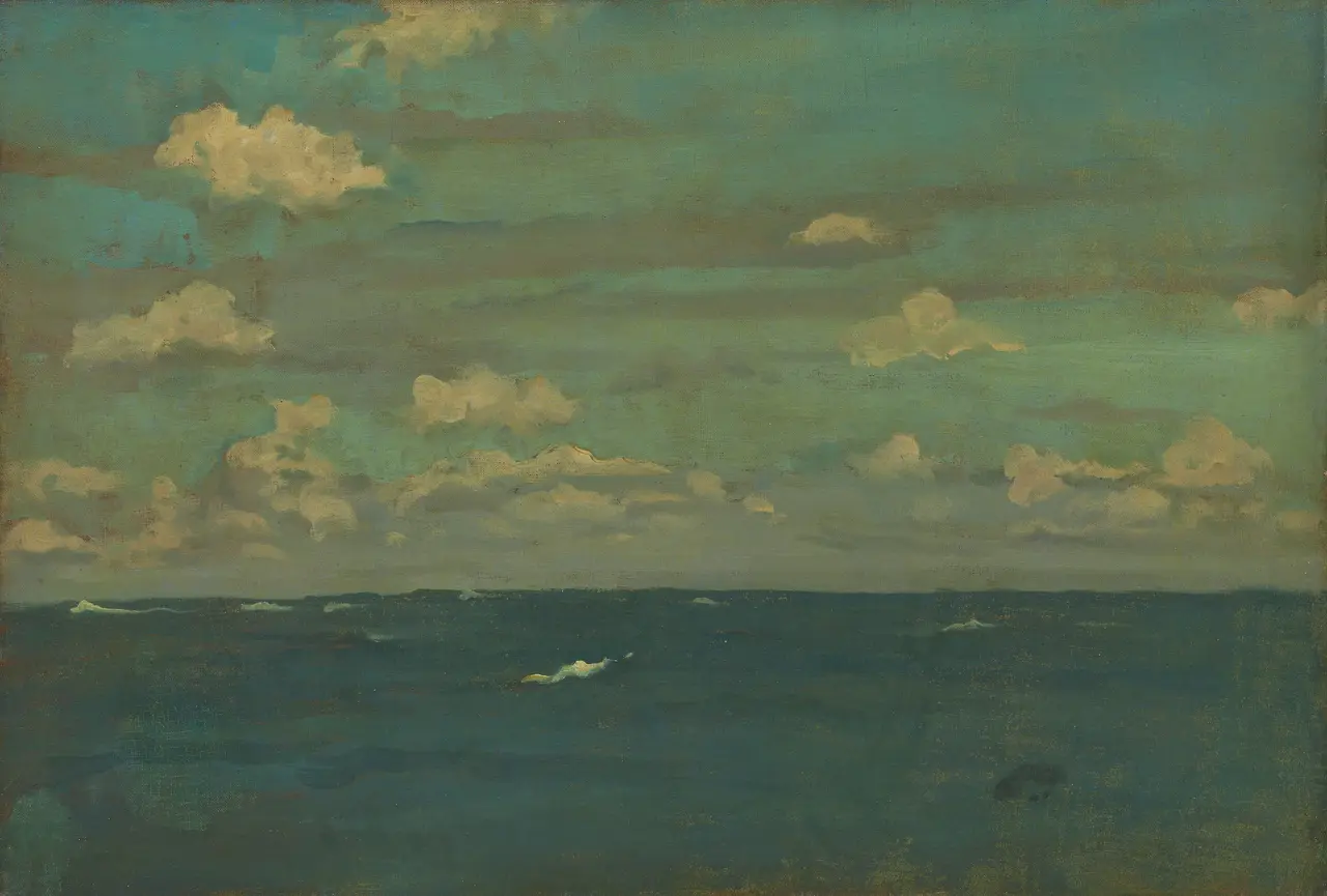
There is a problem with the picture reproduced here. James McNeill Whistler called the painting Violet and Silver, but its clouds look yellow, its sky turquoise, and its water a heavy green. For years, the painting itself looked much like this photograph. The title and the surface seemed to report different weather.
The photograph entered Wikimedia Commons in 2018. In 2025, conservators at the Art Institute of Chicago completed the painting’s first treatment since it came to the museum in 1955. They removed layers of discoloured coating and dirt. Cool violet returned to the clouds; silver returned to the light; the sea emerged as a rich greenish-blue. The title had preserved a better account of the colour than the familiar image had.
A title cannot diagnose a painting. Old varnish can be part of an object’s history, and cleaning can alter more than grime. In this case, the museum had material evidence. The paint remained in very good condition beneath a patchy accumulation of natural resins, including bleached shellac, an acrylic resin, and a protein-based substance that was probably glue from an earlier treatment. The mixture pointed to several campaigns of varnishing, partial cleaning, and revarnishing before 1955. It had settled into the hollows of Whistler’s open-weave canvas, then yellowed and developed fine cracks. Tiny pale speckles disturbed the water. A transparent finish had become a second climate.
The altered colour was especially consequential because Whistler built the seascape from close relations rather than strong separations. Dark water fills the lower third. A straight horizon holds it beneath a much larger sky. Creamy clouds form loose ranks at several heights, and a handful of white crests mark the sea without explaining its depth. No boat, shore, or sail fixes a scale. Colour performs most of the work that objects would usually do.
That colour began below the visible image. Analysis found two preparatory layers on the canvas, first pale grey and then warm red. Whistler spread them unevenly and rubbed parts of the surface, sometimes exposing the ground or even the tops of the canvas threads. Across the sky, purplish-grey paint lies thin enough for red and brown to show through. Where the warmer ground meets intense blue, each makes the other more active. The sky’s temperature depends on what it fails to cover.
Whistler used unusually broad handling in the clouds and small ridges of thicker paint in the waves. Most of the remaining surface is economical. Diluted colour barely coats parts of the weave. The painting measures 50.2 by 73.3 centimetres, close to a French standard no. 20 marine canvas. It was large for his late seascapes. The scale gave his thinned strokes room to cross open cloth while the raised crests remained abrupt, like short pieces of weather caught on the surface.
The work was probably made off the north coast of Brittany. Arthur Jerome Eddy later wrote that Whistler painted offshore while a boatman steadied the vessel. The account suits the low horizon and the broad handling, though it does not prove that every stroke was placed aboard. What the paint establishes is a view stripped to conditions that can change while they are being watched: the width of a cloud, the interval between crests, the blue made sharper by red beneath it.
Varnish entered this delicate construction almost immediately. On 9 January 1894, as he prepared two recent sea pieces for exhibition at the Grafton Galleries, Whistler wrote to the restorer Stephen Richards. He had already put on a thin coat a month or six weeks earlier. He described the pictures as directly painted, without a second paint coat or retouching, then asked Richards to add another coat of varnish and otherwise leave them alone. He wanted an even, perfected surface.
The later yellowing is therefore an awkward consequence rather than a simple cautionary tale. Varnish was part of Whistler’s desired presentation. His own coats were followed by treatments that the record cannot fully assign, and those accumulated materials gradually changed the harmony they were meant to perfect. Protection did not merely sit above the image. It revised every small interval between blue, red, grey, cream, and violet.
During the 2025 treatment, conservators removed the old coatings gradually with solvents and hand-rolled cotton swabs. As the film thinned, the economical surface became legible again. Smooth passages appeared beside low impasto in clouds and waves. The warm ground began to flicker through the blue instead of merging with a general yellow cast. Depth opened between water and the banks of cloud at the horizon. Cleaning recovered both colour and the differences in how the paint occupies the canvas.
The final step was another coat of varnish. The museum chose a thin synthetic layer that gives the paint an even sheen and saturation, in keeping with Whistler’s documented preference. This varnish is designed to remain stable, avoid yellowing, and come off easily when a future treatment requires it. The painting was not returned to an imagined bare origin. It was returned to a varnished state with better prospects for change.
Whistler’s colour titles are often treated as declarations of art over subject, the sea translated into an arrangement of tones. Here the title also became an accidental witness. Violet and Silver kept naming relations that the surface coatings had made difficult to see. It did not tell conservators what to remove or how far to go. It kept the contradiction alive long enough for technical evidence to resolve it.
The older photograph now has a different job. It cannot stand innocently for the painting in its present condition, yet it shows how thoroughly an artwork’s public image can inherit a temporary physical state. Its yellow clouds and murky water record the years when violet and silver survived most clearly in words. The restored canvas has moved on; the digital sea keeps the vanished weather.