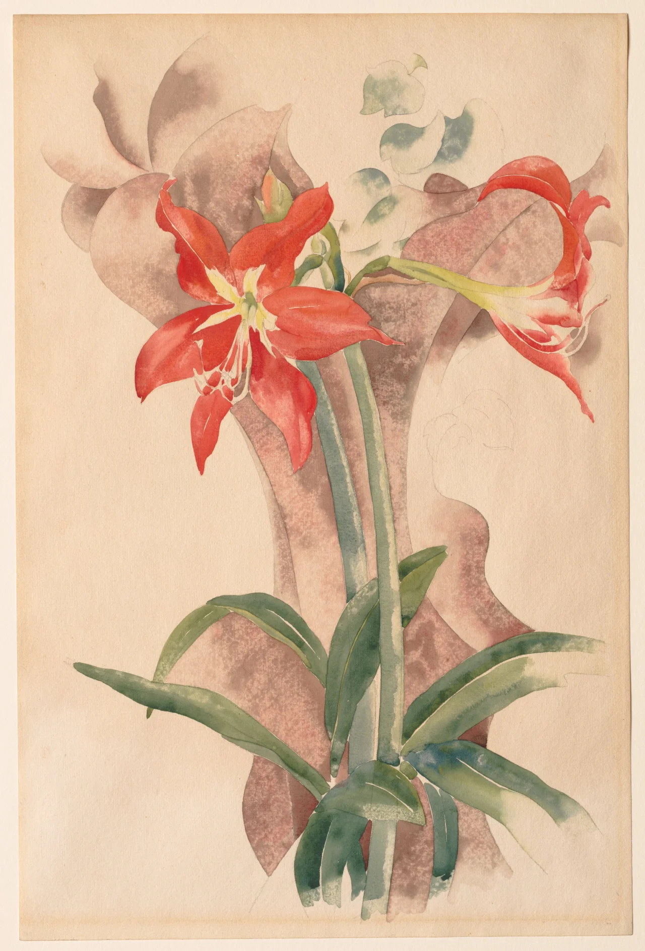
The red arrives before the flower does. In Charles Demuth’s Amaryllis, the color is strong enough to read from across a room and thin enough to let paper show through it at close range. That contradiction is the first thing the sheet asks you to hold. Two blooms sit high on a vertical rectangle of cream wove paper, 45.8 by 30.4 centimeters, and the stems that lift them are thick, green, and deliberately plain. Around them, washes of muted reddish brown and cool gray curve and overlap without describing a wall or a table. Fine graphite lines remain visible under the translucent paint, marking petal edges and leaf veins with a slightly sharper dark. Across the red and across the background, a pebbled, granular texture breaks the wash into small islands of pigment, a surface formed by precise brushing followed by blotting. The paper itself does a surprising amount of work, left untouched as light inside the petals and as air between the stems. You are looking at a flower, and you are looking at a method for making a soft medium stay upright.
Take the bloom on the left first because it declares the terms. Its petals are a warm, slightly orange red, laid down in a single concentration that deepens at the outer edge and lightens toward the throat. At the center a pale yellow opens as a reserve where the brush left the paper almost bare. The graphite under it holds the shape without hardening it, a continuous contour that softens where the watercolor has bled just past the line. Because the wash is blotted, the red is not flat. Tiny granules gather and part, letting the cream ground prick through, so the petal carries both saturation and breath. That granulation is not incidental spatter. It is distributed with control, denser near the petal’s lower curve and more open near the tip, and it continues into the background wash behind the flower where the same pebble interrupts a cooler brown. The effect keeps the red from becoming a poster shape. It stays porous, like a field that has been worked and left slightly uneven so light can settle into it.
The second bloom turns the sheet to the right. Seen more from the side, its form is narrower, its tip arched, its own red overlapping the first flower’s stem. The twist matters because it changes how the stems are understood. They rise from a tight knot at the bottom center, two green cylinders that broaden as they descend and then flare into leaves that are cropped by the sheet’s left and right edges. The leaves are not filler. Their tapered points extend outward at shallow angles, one reaching left and cut off mid blade, another angling right with a central vein left in graphite and a thin white line kept in reserve along its edge. Because the leaves are cropped, they push the flower heads higher and make the lower half of the sheet feel like a base. The stems behave like columns that have been set close together, and the blooms they carry read as capitals that have softened. The scale helps this reading. At under nineteen inches high, the sheet is an intimate object sized for close viewing on a table, yet its vertical proportion and the high placement of the flower heads give it a quiet monumentality, as if a domestic plant had been asked to stand for a small architecture.
Look behind the plant and the sheet refuses to settle into a conventional interior. The background is not a wall, though it suggests one. A broad, warm brown wash makes a curved shape that hugs the left bloom and then drops behind the stems, while a gray passes across the upper right and pools near the bottom in a cooler, more diffuse veil. Where the two washes meet, there is no hard seam. Their edges feather, and in a few places a thin white of the paper keeps them apart, a reserve as narrow as a wire. Because Demuth leaves so much of the cream ground visible around the stems and between the background shapes, the space never quite closes. You cannot decide whether the brown is shadow or a painted backdrop, whether the gray is air or paper left to stand in for it. It keeps the flower both as a specimen seen against a neutral ground and as a decoration floated on a paper field, a double register that many flower watercolors collapse into one side or the other.
The sheet was made in circumstances that make this control more than a stylistic preference. The museum’s description places it while the artist was convalescing with diabetes in his hometown of Lancaster, Pennsylvania. Because of his physical weakness, he was limited to working in watercolor, a less demanding medium than oil, and to subjects that he could easily observe, such as flowers. The note is concise, but it points to a concrete constraint in 1923. Demuth had been diagnosed with diabetes at a time when insulin treatment was still new and daily life required careful management. Extended travel and sustained work in oil, with its solvents and slower, more physically demanding sessions, became difficult. Returning to Lancaster put him among subjects that did not require a studio apparatus or a long outing. A potted amaryllis on a table or windowsill could be observed for hours, turned slightly, drawn repeatedly, and painted in short, precise sessions. The limitation did not diminish the ambition. It shifted the technical problem from how to build a picture through opaque layering to how to make a transparent stain hold a firm edge and a believable volume with minimal means.
That problem was presented in public almost as soon as the sheet was finished. The Cleveland record traces the provenance to Daniel Gallery, New York, where the watercolor was shown in November to December 1923 in Watercolors by Charles Demuth under the title The Lily. The museum bought it during that show, and its acquisition date is recorded as December 20, 1923. The purchase made the sheet one of the first works by Demuth to enter a public museum collection. The sheet then appeared in the museum’s own Contemporary American Watercolors exhibition from December 12, 1923 to January 27, 1924. The interval is tight. A flower painted in a sick room in Lancaster in the course of 1923 was on a gallery wall in Manhattan by late autumn and in a major Midwestern museum by winter. The speed suggests how closely the small New York galleries and the new American collections were watching watercolor at that moment, and how readily a disciplined, modern flower could be read as a serious contribution rather than a minor exercise.
Modern in that context did not mean industrial. Demuth is most widely known for the hard-edged Precisionist cityscapes that followed this flower by a few years, works like Buildings, Lancaster from 1930 and the poster portrait I Saw the Figure 5 in Gold from 1928, where bold lettering and severely abstracted architecture compress the American street into a flat, legible sign. Flower watercolors and factory pictures share a common question: how a flat shape can imply depth without traditional modeling, how an edge can stay sharp and still belong to a volume, how a limited palette can carry a full spatial sensation. The 1928 poster portrait holds with hard edges, flat planes and stenciled numbers that lock. The 1923 amaryllis holds with graphite steadying a wash, reserve holding light and granulation giving a flat stain tactile density. The intelligence remains continuous across the different means. Seeing the flower as part of that continuity clarifies why Demuth’s reputation as a watercolorist of flowers, circuses and cafés, which placed him in the first rank of American watercolorists, belongs to the same sensibility that made the Precisionist pictures, testing itself with different constraints.
Those constraints had a lineage. Demuth had trained at the Pennsylvania Academy of the Fine Arts under Thomas Anshutz and William Merritt Chase, and between 1907 and 1913 he made several trips to Europe where, in Paris, he was drawn to Marcel Duchamp and the Cubists. Those early years of study become visible again in the amaryllis when you look at how the background shapes operate. They are not Cubist faceting in an obvious sense. They are closer to what a student of that moment would have carried back as a habit of seeing: that a picture can be organized by intervals and edges that are allowed to remain flat, and that those flats can still suggest space through adjacency rather than through perspective. The brown and gray curves behind the blooms do that work without quoting Cubism. They keep the picture shallow and legible as paper, while still providing a sense of something behind the plant that recedes. The training in Paris does not appear as a borrowed style. It appears as a permission to let a background stay abstract while a foreground remains observable, and to let the observable foreground be held by a drawn edge rather than by a modeled volume.
The rarity of the sheet in its moment also helps place its current neglect. Flower watercolors were both central and vulnerable to dismissal in the early 1920s. They were central because many American modernists who worked in watercolor, from Marin to Dove to Demuth, used the medium’s portability and speed to test ideas that oil would have made cumbersome. They were vulnerable because the critical language for serious modernism still favored the mural scaled oil or the machine aged subject as the proof of ambition. A small watercolor of a potted lily could be admired, bought, and then filed as charming without being examined for its construction. Later surveys that emphasized Demuth’s factories reinforced that filing. Specialists have followed the flower sheets through Whitney and Museum of Modern Art surveys and later Cleveland Museum publications, while broader attention has favored the more reproducible Precisionist icons. Giving the sheet sustained attention now corrects an emphasis the sheet itself makes available through its exactness.
That exactness is easiest to verify in the color. The red is not one red. It holds an orange warmth at its outer petals and a cooler, slightly bluer red where the petal folds under. The green of the stems is not one green either. It shifts from a sap heavy dark along the central edge to a thinner, yellower veil at the leaf margin where the wash has been lifted. The muted brown and gray behind the plant are kept deliberately low in chroma so the flower can stay saturated without competition, yet they are not neutral in a way that would deaden the sheet. The brown carries a little red, the gray carries a little blue, so the background stays chromatically related to the plant. This relation keeps the picture from splitting into figure and ground as two separate systems. Color moves across the graphite boundary in small, controlled ways. A trace of red finds its way into the brown curve, a touch of gray cools the white reserve between the leaves. Those migrations make the flower feel situated rather than pasted, even though the space around it refuses to become a room.
It is tempting to compare this amaryllis to the flower close ups that Georgia O’Keeffe was making in the same years, large oils where a single blossom fills the canvas and the background dissolves into soft, modulated tone. The comparison is useful only to see how different Demuth’s solution is. O’Keeffe builds her flower through continuous, blended modeling that turns petal into a smoothly turning form and uses the scale shift to make the familiar suddenly architectural. Demuth keeps the sheet small, keeps the plant at a believable size, and makes architecture out of reserve and edge rather than out of enlargement and blending. O’Keeffe fuses edge into volume with soft transitions. Demuth keeps edge as a distinct event, a graphite line that remains legible under the wash and feels like a decision. Both artists understood that a flower could carry modern structure. O’Keeffe built that structure by accumulating tone, Demuth by holding back.
Seen this way, the early acquisition by Cleveland reads as a precise judgment about American watercolor. In 1923 the museum was building a collection of American drawings and watercolors that could stand as a modern field, and it recognized in this sheet a watermark example of what watercolor alone could do. The museum’s later exhibition lineage, from the floral motif shows of 1947 and 1955 to the dedicated watercolor surveys and the master drawings tour in 2000, confirms that the sheet has continued to be used as a touchstone for that field. Its presence among those surveys is not because it is the most dramatic Demuth flower, but because it is the most instructive. It shows, without exaggeration, how a limited palette, a single plant, and a cream sheet could carry a full spatial thought.
To stay with the painting now is to keep two histories in mind at once and to let the paper mediate between them. One history is that of a plant observed in a room in Lancaster during a year when the artist’s body required a different kind of work. The other is that of a modern picture that wants to be read as a structure of intervals, edges, and reserves rather than as a window. The amaryllis does not choose between them. Its red holds because the paper holds. Its stems stand because the graphite holds. Its space breathes because the blotter has held back just enough color to let air remain. Those held conditions are the picture’s content as much as the flower is. When you step back, the blooms resume their simple presence as an amaryllis seen in winter, a common houseplant made to perform in the season when little else blooms indoors. When you step closer, the performance becomes a construction, and you notice that the white you took for background is in fact the light that makes the red possible. That exchange, between plant and paper, is what Cleveland bought in December 1923, and it is what remains available to anyone who looks long enough to see reserve itself as the architecture.