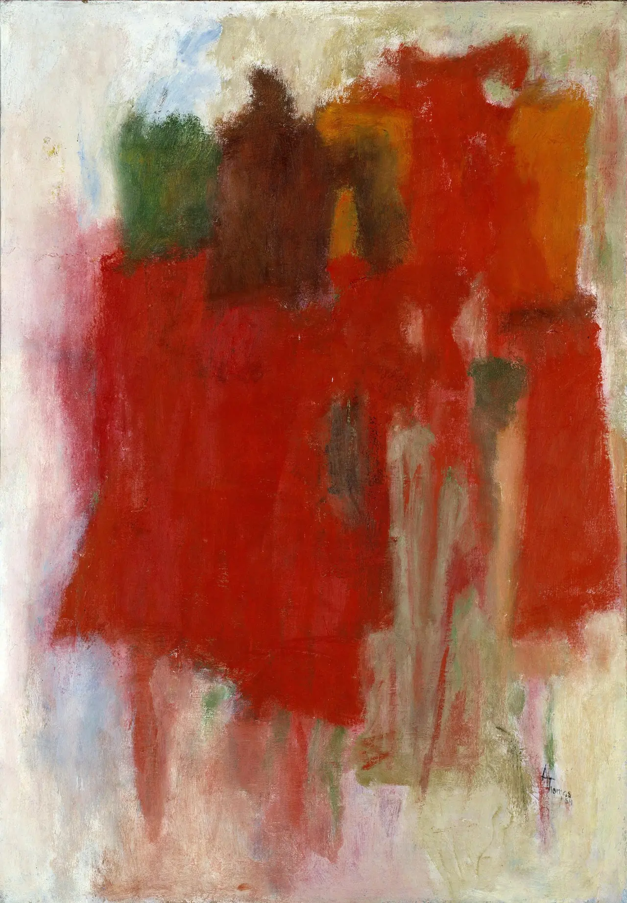
The first thing you meet in Alma Thomas’s Red Abstraction is a weight. Not a shape with an edge that you can name, but a mass that gathers in the middle of a vertical canvas and stays there. Red, orange, rust, brown, and a mossy green press together into a loose rectangle that does not quite reach the sides. Through it, and sometimes underneath it, run darker vertical strokes, black and deep green, that rise like trunks or posts. Around this center the paint thins dramatically. At the top, a broad band of pale gray and off-white opens above the warmth. At the bottom left a patch of cream pushes up into the red. At the right edge the color simply runs out, leaving a near empty corridor where the brush has scraped lightly and the ground shows through.
It is an oil painting from 1959, 101.6 by 70.5 centimeters, vertical, in the Smithsonian American Art Museum. That date matters more than it first appears. Thomas was sixty-eight, still teaching art full time at Shaw Junior High in Washington, D.C. She would retire the following year. She had not yet made the mosaic of small, distinct marks that would become her signature after the mid-1960s. She was working in oil, not the acrylic she would later use for crisp, high-key stripes. The painting belongs to a brief interval the museum describes as a shift that began in the late 1950s, before high-key color and before the systematic rows that made Thomas widely known. Red Abstraction does not look like a preparation for those later works. It looks like a complete argument built with different means.
The argument is about color as structure. Thomas lets color do the work that line or perspective might otherwise do. The central field holds together because warm hues advance while the pale surround recedes, not because an outline contains them. Within the mass, temperature shifts carry differentiation: a cooler brown-green holds an interval against a hotter orange-red, a streak of cream interrupts and forces a new adjacency, a black vertical halts one passage and starts another. When you follow the black strokes, you notice they are not placed on top as a final drawing. Some are dragged through wet warm paint, pulling red into black. Some sit under translucent red that was pulled across them. The relation is one of intercutting rather than layering, which is why the trunks feel embedded in foliage rather than posted in front of it.
Standing before the source file at close scale, the handling becomes more particular. Thomas works with a range of loads. In the center she pushes paint with a loaded brush that leaves ridged impasto and uneven edges, then thins the same brush to wipe a veil that barely tints the ground. She uses the side of the brush to scrape a ragged horizon inside the mass, and the tip to pull a narrow, slightly wavering black line that does not stay uniform. At the margins she allows the canvas to remain active. The top pale band is not flat; it carries faint horizontal dragging and small deposits of warm color that have been carried outward, as if the center had bled a few steps before stopping. The right edge reveals the most economical passage: a dry brush skips across the texture, leaving a broken field of white and pale blue that reads as light and also as nothing more than paint running out of material.
This kind of attention connects directly to what Thomas said she looked at. The museum’s Luce Center label quotes her observation of new colors appearing through windowpanes whenever plants moved in wind, and notes that she painted from the garden outside her kitchen window. The label’s reading of Red Abstraction is appropriately modest: reds, browns, and greens make a warm heavy mass in the center contrasting with paler shades at the edges, evoking the burst of treetops in fall. The object description goes slightly further, suggesting that vertical swipes of black suggest the directional growth of trees while oranges and reds evoke vibrant foliage. Both readings stay close to sensation rather than symbol, which is consistent with Thomas’s own emphasis on beauty’s restorative capacity and with her remark that artistic inspiration rises from nature.
It helps to know the constraint under which that sensation was made. Thomas’s timeline is unusual and often compressed in shorter accounts. She was born in 1891 in Columbus, Georgia, moved with her family to Washington in 1907, and became Howard University’s first fine arts graduate in 1924. She then taught for thirty-five years, beginning in 1924, while continuing to study: a master’s in arts education at Columbia in 1934, and classes at American University during the 1950s with Joe Summerford, Robert Gates, and Jacob Kainen. Those American University years introduced sustained work in color theory and contact with a Washington painting conversation that included Morris Louis, Kenneth Noland, and Gene Davis, though Thomas did not adopt their staining or hard-edge methods. The National Museum of Women in the Arts biography records that her Howard professor James V. Herring and her peer Loïs Mailou Jones each pressed her toward abstraction, but teaching left limited studio hours, and her early exhibiting record remained representational and academic.
1959 sits inside that constraint. The painting precedes the event most narratives treat as the break: a Howard retrospective invitation for 1966 that prompted new work, and the subsequent development of what she called, with characteristic pragmatism, stripes and lozenge marks arranged in rhythmic patterns. Red Abstraction shows what her abstraction looked like when it still had to be made in the margins of a full teaching schedule, in oil, with brushes that could be picked up and set down. Its syntax is not yet systematic. It relies on a single, large chromatic decision and on the felt memory of how a garden holds light in October. That economy is its clarity.
Washington in these years offers a useful contrast rather than a lineage. The Washington Color School painters were pouring and staining to remove touch, often working on unsized canvas on the floor to achieve flat, expansive fields. Thomas at this point is emphatically a hand painter. She builds surface through touch, and she retains a window view even when she removes description. Her vertical black intervals have more in common with a remembered stand of trees than with a structural grid, and her pale surround functions more like air and distance carried by thin paint than like an unpainted ground deliberately left exposed. The fact that the museum notes she was identified with Color Field painters like Louis, Davis, and others since the 1950s records proximity and mutual respect, not imitation. Her way of making a field red is different: she accumulates warm paint and then interrupts it, rather than flooding a field with a single hue.
Those interruptions deserve a longer look. The most instructive moment lies about a third of the way up, where a horizontal band of cooler cream and gray cuts across the warm mass and the black verticals. The cut is not clean. Its upper edge frays into red, its lower edge carries small upward drags of orange. On one level this passage simply lightens a dense area, giving the eye a rest. On another it reproduces, in abstract terms, the sensation of looking through foliage toward a lighter opening, a moment when leaves thin and sky asserts itself. Thomas does not need to specify sky. She needs the temperature contrast and the change in paint density to carry the spatial cue. A second passage at the lower left works similarly. A wedge of cream pushes diagonally into the red-orange, its boundary softened by scumbling so that the warm and cool do not meet as shapes but as interpenetrating films. That softness keeps the rectangle from reading as architecture. It remains foliage whose density varies.
The black verticals reinforce this reading without insisting on it. Count them. There are roughly six to seven main strokes, uneven in weight, with several fainter echoes between. They do not divide the canvas regularly. One strong stroke near the left holds a slight right lean and carries a small outward flare where the brush restarted. A second, more central, breaks mid-length where the loaded brush skipped. A third at the right is paler, as if made with paint thinned almost to ink. Their irregular spacing prevents the painting from settling into a stripe system. Instead, the intervals become part of the color composition: a wider warm interval feels more open, a narrower interval where two blacks stand close together feels compressed and darker. This is the same logic that Thomas would later systematize with equalized marks and measured intervals, but here the intervals remain approximate and responsive to the particular pressure of this central mass.
The pale surround completes the effect. The top band is wide enough to act as a sky band, but it is handled so thinly that it never becomes a separate shape. Tiny flecks of warm color carried upward and occasional thin black ticks that reach into the pale area prevent a hard boundary. The painting maintains a single field that is dense at center and rarefied at periphery, which translates, without illustration, the visual experience of a garden seen from a window. The near is saturated and textured. The far is light and almost empty. The trunks connect them.
It is worth pausing on material fact, because it explains some of what this field can and cannot do. Oil in 1959 gives Thomas open time. She can scrape back into a passage after it has been laid down, pull a gray veil over a black stroke, or drag warm color outward before it sets. Much of the subtlety at the edges depends on that working time. When she later moved to acrylic for her mature work, the handling changed: marks become more discrete, edges more contained, drying faster, layering with less intermix. The mosaic approach compensates for that rapid drying by making interval and hue adjacency the primary generator of light, while Red Abstraction relies on blending and wiping. The two methods arrive at luminous color through opposite means, and the earlier method carries a particular softness under the intensity that the later method rarely allows.
Context confirms that software of color was on Thomas’s mind as a long study, not a new enthusiasm. Her American University work included extended attention to color theory, and the Smithsonian’s exhibition history for Thomas places her 1959–1978 output as the period of most sustained invention, with continuous material research even as arthritis later limited her mobility. The 2023–2024 exhibition Composing Color, which drew on the museum’s holdings including thirteen works bequeathed by Thomas after her death in 1978, organizes her mature themes as Space, Earth, and Music. Red Abstraction precedes those categories, yet it already shows how Thomas could treat a garden as all three at once: earth in the foliage mass, space in the pale recession, and music in the repeated vertical intervals that behave like a pulse without becoming meter.
An essay about this painting should not overstate its singularity. Thomas made other transitional works around 1958, such as The Stormy Sea in the Smithsonian collection, that also move away from representation. What distinguishes Red Abstraction is its organization around a single color. Rather than distributing hues widely across a field, Thomas commits to the narrow range of fall reds and builds variation through warmth, density, and vertical interruption. The result holds a seasonal sensation in a way a more variegated palette would disperse. The painting does not depict autumn leaves; it makes an interval of red feel like the condition of being surrounded by them, seen through the particular distance of a window.
There is a temptation, when writing about Thomas, to fold 1959 into a story of later triumph, with the 1972 Whitney solo exhibition as its proof and the White House presentations as its coda. That arc is real. Thomas did become the first Black woman to have a solo presentation at the Whitney, and the Smithsonian’s biography records the 1972 Whitney and Corcoran presentations and the critical attention that followed a career mostly worked out outside New York. But to read the 1959 canvas only as a step toward that recognition is to misjudge its completeness. Its ambition is fully realized on its own terms: to find an abstract structure that remains answerable to a specific light and a specific aggregated color, without recourse to mosaic regularity, hard edge, or stain.
Looking again, the painting’s most achieved property is the way it prevents either reading from stabilizing. If you seek a garden, the verticals and the central warmth offer enough. If you seek abstraction, the thin edges and the material handling provide sufficient autonomy. The painting keeps both possibilities present and slightly out of alignment, which is why it continues to hold attention. It asks a viewer to shuttle between spatial sensation and paint fact, never allowing one to resolve the other. That shuttling is not a puzzle to be solved. It is the subject.
In the last decade Thomas’s late work has been photographed, conserved, and exhibited widely, with close technical study of her graphite guiding lines and her layering. The National Museum of Women in the Arts conservation partnership with the Smithsonian’s Lunder Center that examined Iris, Tulips, Jonquils, and Crocuses and Orion revealed methodical pencil structure under the apparently spontaneous dabs, and even a handprint left in fluorescing pigment. Red Abstraction has not received that level of imaging in the published record, but its surface makes clear that Thomas was already working between structure and immediacy. The vertical blacks function as both structure and gesture, and the pale edges show the discipline of leaving areas thin enough to breathe. No published source suggests underdrawing for this work, yet the evenness of the marginal thinning suggests forethought about where intensity would gather. Even where it appears most intuitive, the painting maintains a controlled economy of means.
The painting also clarifies why the later stripes were a necessary invention rather than a stylistic preference. A single warm mass, however responsive, can only sustain a limited number of adjacencies. The mosaic method, with its small, equalized units, allows Thomas to distribute high-key color across a much larger interval without losing coherence, and to make rhythm explicit rather than implied. Red Abstraction reaches the limit of what the single-mass approach can carry and, in doing so, makes the logic of the next step legible. That legibility is part of its value for a contemporary viewer who knows the later work first.
From a window in the same house her father bought in 1907, Thomas reported watching colors shift whenever plants moved in wind. The remark is simple and often repeated, but Red Abstraction gives it physical sense. The painting does not illustrate that movement. It produces an equivalent instability in hue and edge: reds that never settle to one red, blacks that interrupt but do not fix, whites that remain slightly warm. Color, in Thomas’s phrasing, is life because light is change. The painting honors that change by refusing a single finished chord.
It is a garden painting that has learned to do without a garden. It is also a color field painting that has learned to do without stain. Its red holds because the vertical intervals give it a measure, and the pale surround gives it air. After a long look, the most durable memory is not the hue but the pressure between the center and the margin, between loaded paint and wiped ground, between the suggestion of trunks and the fact of brush strokes. That pressure is what makes this transitional canvas more than a footnote. It is a complete, habitable abstraction made in the final year of a thirty-five-year teaching career, before retirement made a new rhythm possible, and it still rewards the attention it was made with.